
文章目录
一、为什么需要自定义 TabBar?
系统默认的 Tabs 组件能快速搭建标准底部导航,但遇到以下场景时无能为力:
| 场景 | 系统 Tabs 是否支持 |
|---|---|
| 标准底部导航(图标+文字) | 支持,直接用 BarPosition.End |
| 带阴影和圆角的浮动标签栏 | 不支持,需完全自定义 |
| 突出中间项的舵式标签栏 | 不支持,需完全自定义 |
| 选中指示条动画 | 有限,需配合自定义实现 |
二、公共数据类型
两种标签栏都依赖项目的 TabItem 和 TabBarTheme 接口:
// entry/src/main/ets/types/TabBarTypes.ets

export interface TabItem {
  id: string;           // 唯一标识
  icon: Resource;       // 未选中图标
  activeIcon: Resource; // 选中图标
  title: string;        // 标签文字
  badge?: number;       // 角标数量(可选)
  showDot?: boolean;    // 是否显示红点(可选)
}

export interface TabBarTheme {
  backgroundColor: ResourceColor;
  activeColor: ResourceColor;
  inactiveColor: ResourceColor;
  height: number;
  iconSize: number;
  fontSize: number;
}
代码说明:把数据结构和主题配置拆成独立接口,修改外观只需换一个主题对象,UI 代码不需要改动。
三、浮动标签栏
3.1 视觉效果图
3.2 FloatingTabBar 核心实现
@Component
struct FloatingTabBar {
  @Link currentIndex: number;  // 双向绑定,子组件可直接修改父组件状态
  @Prop theme: TabBarTheme;
  @Prop tabs: TabItem[];
  onTabChange?: (index: number) => void;

  build() {
    Row() {
      ForEach(this.tabs, (tab: TabItem, index: number) => {
        Column() {
          SymbolGlyph(this.currentIndex === index ? tab.activeIcon : tab.icon)
            .fontSize(24)
            // SymbolGlyph.fontColor 接受 ResourceColor[] 数组,必须用方括号包裹
            .fontColor(
              this.currentIndex === index
                ? [this.theme.activeColor]
                : [this.theme.inactiveColor]
            )

          Text(tab.title)
            .fontSize(this.theme.fontSize)
            // Text.fontColor 直接传 ResourceColor,无需数组
            .fontColor(
              this.currentIndex === index
                ? this.theme.activeColor
                : this.theme.inactiveColor
            )
            .margin({ top: 2 })
            .fontWeight(
              this.currentIndex === index ? FontWeight.Medium : FontWeight.Normal
            )

          // 选中指示条:使用 if/else + transition 实现淡入动画
          if (this.currentIndex === index) {
            Row()
              .width(20).height(3)
              .backgroundColor(this.theme.activeColor)
              .borderRadius(1.5)
              .margin({ top: 4 })
              .transition({ type: TransitionType.Insert, opacity: 0 })
              .animation({ duration: 200, curve: Curve.EaseInOut })
          } else {
            Row().width(20).height(3).margin({ top: 4 })
          }
        }
        .width(64)
        .height(this.theme.height)
        .justifyContent(FlexAlign.Center)
        .onClick(() => { this.onTabChange?.(index); })
      })
    }
    .height(this.theme.height + 16)
    .padding({ left: 16, right: 16, top: 8, bottom: 8 })
    .margin({ left: 24, right: 24, bottom: 20 }) // 不贴边,四周留白
    .backgroundColor(this.theme.backgroundColor)
    .borderRadius(28)                             // 大圆角
    .justifyContent(FlexAlign.SpaceEvenly)
    .shadow({
      radius: 20,
      color: 'rgba(0, 0, 0, 0.08)',
      offsetX: 0,
      offsetY: 4                                  // 向下偏移,模拟悬浮投影
    })
    .expandSafeArea([SafeAreaType.SYSTEM], [SafeAreaEdge.BOTTOM])
  }
}
代码说明:
@Link双向绑定,父组件传递$currentIndex,子组件内部可直接读写,两侧数据同步;SymbolGlyph.fontColor()参数类型是ResourceColor[],一定要写成数组形式;而Text.fontColor()参数是ResourceColor,不需要数组;- 指示条用
if/else条件渲染配合transition,这样在元素插入时可以触发淡入动画; .expandSafeArea([SafeAreaType.SYSTEM], [SafeAreaEdge.BOTTOM])让标签栏延伸到系统导航条区域,避免被遮挡。
3.3 父页面:Stack 叠层组合
@Entry
@Component
struct FloatingTabsDemo {
  @State currentIndex: number = 0;
  @State theme: TabBarTheme = FloatingTheme;
  @State tabs: TabItem[] = [];

  build() {
    Stack({ alignContent: Alignment.Bottom }) {  // Stack 让标签栏叠在内容上方
      Column() {
        FloatingContentPage({ ... })
      }
      .width('100%').height('100%')

      FloatingTabBar({
        currentIndex: $currentIndex,   // $ 传递双向绑定引用
        theme: this.theme,
        tabs: this.tabs,
        onTabChange: (index: number) => {
          animateTo({ duration: 250, curve: Curve.EaseInOut }, () => {
            this.currentIndex = index;
          });
        }
      })
    }
    .width('100%').height('100%')
  }
}
代码说明:Stack 布局是浮动标签栏的关键,它让标签栏悬浮在内容上方,而不是和内容并排布局。animateTo 包裹状态变更,为内容区切换添加过渡动画。
四、舵式标签栏
4.1 视觉结构
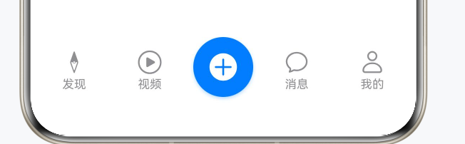
标签数量必须是奇数(3、5、7),保证中间项落在正中央。
4.2 SteeredTabBar 核心实现
// entry/src/main/ets/pages/demos/SteeredTabsDemo.ets

@Component
struct SteeredTabBar {
  @Link currentIndex: number;
  @State tabs: TabItem[] = [];

  // 动态计算中间索引,支持任意奇数个标签
  private isCenterItem(index: number): boolean {
    return index === Math.floor(this.tabs.length / 2);
  }

  build() {
    Row() {
      ForEach(this.tabs, (tab: TabItem, index: number) => {
        if (this.isCenterItem(index)) {
          // 中间突出项:圆形背景
          Column() {
            SymbolGlyph(this.currentIndex === index ? tab.activeIcon : tab.icon)
              .fontSize(28)
              .fontColor(['#FFFFFF'])
          }
          .width(56).height(56)
          .backgroundColor('#007AFF')
          .borderRadius(28)  // 宽高一半 = 正圆
          .justifyContent(FlexAlign.Center)
          .shadow({
            radius: 8,
            color: 'rgba(0, 122, 255, 0.3)', // 阴影颜色与背景色呼应
            offsetX: 0,
            offsetY: 4
          })
          .onClick(() => { this.currentIndex = index; })

        } else {
          // 普通项
          Column() {
            SymbolGlyph(this.currentIndex === index ? tab.activeIcon : tab.icon)
              .fontSize(24)
              .fontColor(this.currentIndex === index ? ['#007AFF'] : ['#8E8E93'])

            Text(tab.title)
              .fontSize(11)
              .fontColor(this.currentIndex === index ? '#007AFF' : '#8E8E93')
              .margin({ top: 2 })
          }
          .width(60).height(50)
          .justifyContent(FlexAlign.Center)
          .onClick(() => { this.currentIndex = index; })
        }
      })
    }
    .width('100%').height(70)
    .padding({ bottom: 8 })
    .justifyContent(FlexAlign.SpaceEvenly)
    .alignItems(VerticalAlign.Bottom)  // 底部对齐,中间圆形按钮自然向上凸出
  }
}
代码说明:
isCenterItem()用Math.floor(length / 2)动态计算中间索引,标签数量变化无需改代码;- 圆形通过
borderRadius等于宽高的一半来实现,width(56)+borderRadius(28)即正圆; alignItems(VerticalAlign.Bottom)让所有项底部对齐,中间项更高,视觉上自然向上凸起;- 中间项的阴影颜色用带透明度的蓝色,与背景色呼应,比黑色阴影更精致。
4.3 与 Swiper 联动实现手势滑动
本项目的舵式标签栏使用 Swiper 作为内容区,支持手势滑动:
Swiper() {
  ForEach(this.contents, (item: string[], index: number) => {
    ContentPage({ ... })
  })
}
.index(this.currentIndex)  // 与 currentIndex 绑定
.loop(false)
.indicator(false)           // 隐藏默认指示点,标签栏已起到指示作用
.duration(300)
.onChange((index: number) => {
  this.currentIndex = index;  // 手势滑动时同步更新标签选中状态
})
代码说明:Swiper 和 SteeredTabBar 共享同一个 currentIndex,互相监听 onChange,任一方的变化都会驱动另一方更新,无需手动同步。
五、尺寸规范参考
| 场景 | 属性 | 推荐值 |
|---|---|---|
| 浮动 | 左右外边距 | 20-24vp |
| 浮动 | 圆角半径 | 24-28vp |
| 浮动 | 阴影模糊半径 | 16-24vp |
| 舵式 | 中间项直径 | 52-60vp |
| 舵式 | 标签数量 | 3、5 或 7(奇数) |
总结
浮动标签栏和舵式标签栏看起来效果很炫,但核心原理其实很简单:前者靠 Stack 叠层、圆角和 shadow 实现悬浮感,后者靠 borderRadius 等于宽高一半画出正圆突出中间项。两种样式背后的逻辑都是:把 barHeight 设为 0 隐藏系统默认标签栏,然后自己用组件拼出想要的 UI。希望这两个完整的例子能让你在拿到设计稿时,少走一些弯路,直接动手就能写出来。
转载自CSDN-专业IT技术社区
原文链接:https://blog.csdn.net/qq_33681891/article/details/160383030